History ↓
What do you think about Didone typefaces? Didone means high contrast typefaces; They've some very thin strokes and others thick ones. Although, there are a few typography styles that the world has made that are related to concepts such as elegance, fashion style and other ones.

From my point of view, it has always been boring to me haha. The Ductus that they have in the majority of the models, I mean the classic ones, seems to lack all aesthetic and organic sense, and being said in other words, boring. The algebraic work and anti-amanuense in this type of project were never make them feel attractive, so I started to study the proportion of many venetian typefaces. which means, typefaces that try to imitate in their majority the calligraphy writing, in which in the book “Designing Type Revivals” of Ricardo Olocco and Michele Patanè was very helpful in their pedagogic and visual content.


FJ Meduza Collection™ was born from the proposal of a logo that I made. For that matter, I systematized a couple of their letters until I got a big character set. Furthermore, generally I tried to challenge myself by means of those kinds of typographic systems and projects that help me to get out of my comfort place or I’ve never made it before.

Therefore, I decided to design another version —following the same ductus of the principal typeface— for texts and small sizes, for example, newspapers. FJ Meduza Collection™ is a typographic system, means, content variants to title and text uses; providing versatility and aesthetic when someone is to select a classic typeface, but it isn't the same typical typeface.

So, ¿is this project just shown, like, was tried to design just another Bodoni? Maybe yes, it could be right, I prefer to raise a interrogant: Why do we keep using, for example, “Helvetica”? and, Why are there type foundries in the world designing their own “Helvetica, Bodoni or Slab Serif” versions?. I’m not sure that’s because Helvetica is a perfect option; We know that it’s popular because this was a workhorse from the International Typography System, but, ¿why are they producing typefaces under those great classics or canons? Well, let’s have a discussion.
w
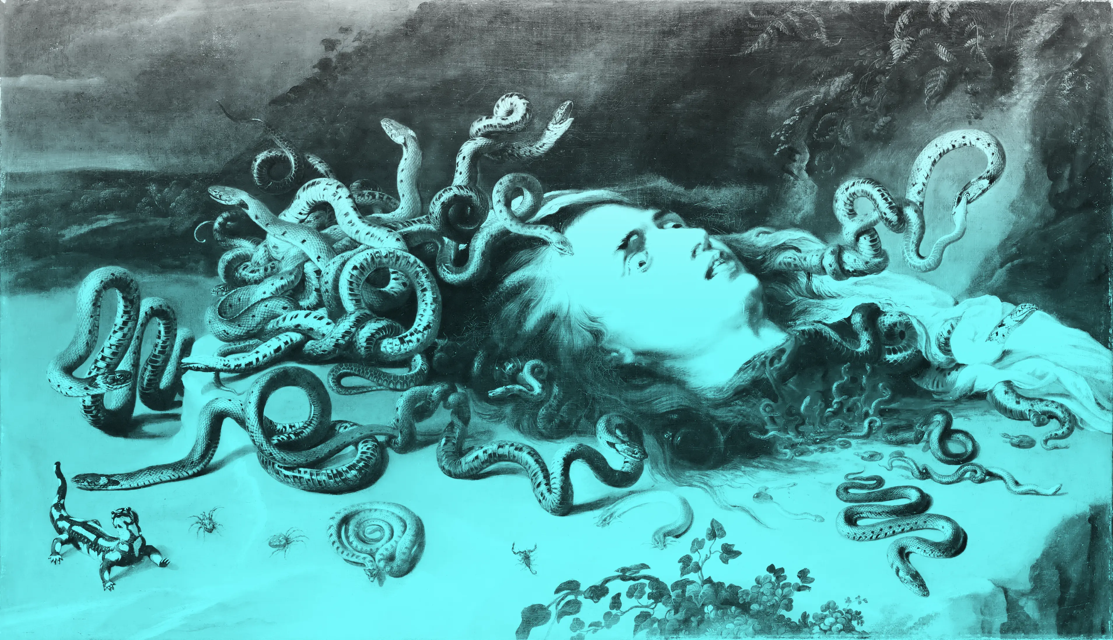
Peter Paul Rubens (Siegen, Westfàlia, 28 de juny del 1577 – Anvers, 30 de maig del 1640), va ser un diplomàtic, i el pintor barroc més popular de l'escola flamenca. El seu estil exuberant emfatitzava moviment, color i sensualitat. Va tractar tota classe de temes pictòrics, de religió, d'història, de mitologia clàssica, escenes de caça, retrats, així com il·lustracions per a llibres i dissenys per a tapisseries. Va ser molt prolífic en la producció d'obres; es calcula que va arribar a pintar uns 3.000 quadres gràcies, en part, als membres del seu taller que, pel que sembla, treballaven en cadena. Van ser deixebles seus Jacob Jordaens i van Dyck.[2] Dominava diverses llengües i va ser un gran humanista i un bon diplomàtic.[1]

With a some Alternates for
taste a nice title
or
paragraph


ABOUT this and more typefaces ↓
Get a License here!Credits
- Original Text:
- Franco Jonas
- English Translation:
- Franco Jonas & Valentina Pino
- Portuguese Translation:
- Samuel Croda